Bedroom styling · Colour and space
Styling Emerald Green in a Modern King-Size Bedroom
A king-size bed gives a bedroom a natural centre of gravity. Emerald green can make that presence feel intentional, adding depth and character without overwhelming the room. The key is to consider proportion, daylight, materials, and the quieter colours around it before deciding where the green should appear.
Begin with the bed’s visual weight
A king-size bed occupies a generous field of floor and often becomes the first thing the eye meets on entering a bedroom. That scale makes colour especially consequential. A deep green upholstered headboard, for example, can read almost like an architectural panel: a broad, calm plane behind the pillows. A green duvet or quilt creates a softer, more changeable focal point. Smaller accents, such as a cushion or throw, offer a way to test the shade before giving it a larger role.
Think of the bed as a landscape with several layers rather than a single object. The frame establishes its outline; the mattress and bedding create broad blocks of colour; pillows, blankets, and nearby furniture add smaller notes. Emerald can appear in one layer or move lightly between several. Repetition helps a room feel connected, but it need not be exact. A green headboard paired with a few olive or moss accents, for instance, can create a family resemblance without making every textile match.
Before choosing a particular shade, consider how much of the bed will be visible. A tall headboard makes a colour statement even when much of the bedding is pale. A low-profile platform bed may leave more of the wall exposed, so an emerald coverlet or a painted accent behind it could carry more visual weight. The goal is not to follow a formula, but to decide deliberately where the room’s strongest colour should live.
Room dimensions matter, too. In a larger bedroom, the bed can sit within a more generous arrangement, with space for bedside tables, a bench, or a reading chair. In a compact room, the same king-size mattress may leave narrow routes around its edges. Keeping the palette contained and furniture profiles simple can help the room feel composed rather than crowded.
Read the light before settling on a green
Emerald is not one fixed colour. It may lean blue, suggesting the cool depth of shaded foliage, or yellow, bringing a warmer, more botanical impression. Its appearance changes with the light that reaches it. North-facing rooms often receive cooler, more even daylight; south-facing rooms may glow warmly for much of the day. At night, lamps can shift the same fabric or painted surface again.
It is useful to observe a sample in the room rather than judging it under showroom lighting or on a screen. Place a fabric swatch, paint sample, or bedding colour near the bed and look at it at different times: early morning, midday, late afternoon, and after dark. Notice whether it becomes almost black in shadow, bright and jewel-like in direct light, or softer and more muted beside the room’s existing finishes.
In a bedroom with limited daylight, emerald may be most successful in measured doses. A cushion, throw, or small upholstered detail can provide depth while pale walls and light bedding preserve brightness. In a sunlit space, deeper green can feel vivid and grounded, particularly when balanced with natural materials and open areas of neutral colour. Neither approach is inherently better; the room’s light and the atmosphere you want to create should guide the choice.
Artificial lighting deserves the same attention. Warm lamps tend to bring out yellow or earthy undertones, while cooler lighting can make green feel sharper or more blue. Layered lighting—a combination of general illumination and bedside lamps—also creates a more nuanced scene than a single bright ceiling light. If possible, assess your colour choices under the lamps you actually use in the evening.
Build a calm bedroom colour palette
Because emerald is saturated, it benefits from companions that give the eye room to rest. Warm white, cream, soft grey, and sand can form a quiet background for a green focal point. These colours do not have to appear everywhere. A pale wall, natural-coloured bedding, and a neutral rug may be enough to offset a dark headboard or coverlet.
For a warmer, more grounded mood, consider a palette of emerald, ivory, and wood. For a cooler, more restrained effect, pair green with stone, charcoal, or a gentle grey. Blush, muted rust, and ochre can provide contrast, but they are most effective when used sparingly—perhaps in a small textile or a piece of art—so the bedroom remains restful rather than busy.
It can help to think in terms of proportion rather than a rigid colour rule. Give the most expansive surfaces a quieter role, then let emerald occupy a more defined area. If the bed itself is green, walls and larger furnishings can stay comparatively calm. If the bed is neutral, a green throw or pair of cushions can introduce colour without taking over the room. Either way, leaving some surfaces visually simple allows the rich shade to register clearly.
Green also varies naturally across textiles. Velvet catches light differently from linen; a woven throw may look mottled and soft where a smooth duvet appears more uniform. Mixing textures in related tones can add depth while keeping the colour scheme coherent. A patterned textile may combine several greens, but repeating one or two of its quieter colours elsewhere can help it feel at home.
Let wood tones bring warmth and structure
Wood provides a useful counterpoint to the cool richness of emerald. Its grain, colour, and finish introduce natural variation, helping a modern bedroom feel welcoming rather than stark. Pale maple can keep the palette light; cherry adds warmth and a reddish undertone; walnut creates a deeper, more formal contrast. The right choice depends on the room’s existing floor, trim, and furniture, as well as the particular green you have chosen.
Matching every wooden surface exactly is rarely necessary. A bedroom can include several wood tones and still feel cohesive if their undertones are considered. Notice whether each finish appears golden, red, neutral, or dark brown. Then look for a point of connection: similar warmth, a shared level of contrast, or repeated shapes and details. A pale floor with a deeper bedside table can feel intentional when the bedding and wall colours bridge the difference.
Keep the furniture around a strong green bed visually composed. A streamlined bedside table, a restrained lamp, or a simple dresser can provide everyday function without competing for attention. Repeated materials—wood at the bedside, perhaps echoed by a frame or small stool—create rhythm across the room. The repetition can be subtle; it need not turn the bedroom into a matched set.
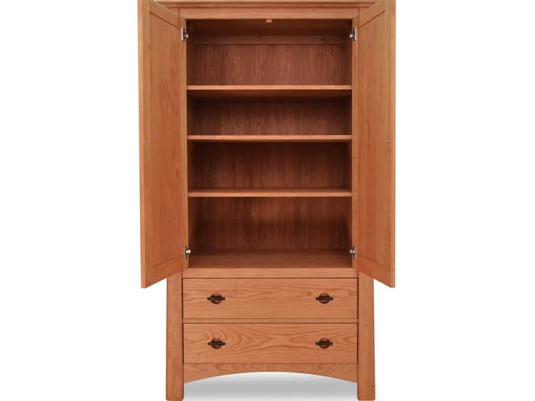
A solid-wood storage piece can also contribute useful warmth without adding another prominent colour. The Cherry Moon Armoire, made from solid hardwood and offered in natural cherry, maple, or walnut options, is one example of a tall storage form that can bring wood grain and a clear vertical line into a bedroom. Its scale means placement matters: leave enough space for its doors and drawers to be used comfortably, and consider how its finish relates to the bed and floor.
Wood is not merely a colour choice; it is a material with visible grain and a tactile presence. Against a smooth painted wall or a plain duvet, those details can make the space feel layered and lived in. Let the furniture’s shape and finish do some of the decorative work, rather than adding ornament to every available surface.
Choose bedding that softens, not competes
Bedding covers a large portion of a king-size bed, so its colour can either reinforce emerald or temper it. Crisp white and warm ivory create contrast and keep a dark green headboard distinct. Stone, oatmeal, and pale taupe make the transition gentler. A bed dressed in several quiet neutrals can make a single green blanket feel deliberate rather than dominant.
Texture can soften a strong colour even when the palette stays simple. Linen has a relaxed surface and tends to develop gentle creases; cotton percale feels crisp and matte; quilted or woven layers add pattern through construction rather than bright colour. Mixing a smooth base with a more tactile coverlet can bring dimension to the bed without requiring multiple competing prints.
For a tonal arrangement, combine emerald with lighter or dustier greens. A dark green cushion beside a sage or eucalyptus throw can suggest variation in a forest canopy, while remaining closely related in colour. The effect is more natural when the shades are not identical. At the same time, too many near-matching greens can look accidental, so keep one shade clearly dominant and let the others act as supporting notes.
Patterns can work, provided their scale and contrast suit the room. A small botanical motif or a restrained stripe may add interest to otherwise plain bedding. If the pattern is bold, keep nearby textiles quieter. The king-size bed already provides a broad visual surface; it does not need every pillow and blanket to announce itself at once.
Think practically as well as aesthetically. Bedding should be comfortable to sleep in and manageable to wash or maintain. If emerald appears on the duvet cover, it may be easy to change the room’s appearance with a different cover when seasons or preferences shift. If the colour is in the upholstered frame or headboard, it becomes a longer-term commitment, so examining samples and considering the bedroom’s future palette are worthwhile steps.
Use accents with intention
Small accessories can carry emerald beyond the bed and make the colour feel integrated. A ceramic vase, a book cover, a piece of art, or a narrow cushion can repeat the shade at a distance from the headboard. These touches create a visual path across the room. They work best when distributed thoughtfully rather than gathered into a single crowded cluster.
Metal finishes can refine the palette. Brass and bronze bring warmth, while black or brushed nickel can lend a more restrained, contemporary note. A lamp base, drawer pull, or mirror frame may be enough. Mixing several prominent metal finishes can distract from the simple relationship between green, wood, and bedding, so decide which finish should lead and keep others secondary.
Plants may seem an obvious companion to green, but their role is not simply to repeat the colour. A living plant introduces changing shapes and textures, and it can soften the geometric outlines of a bed or dresser. Choose greenery according to the room’s actual light and the care you can provide. A bedroom should not depend on plants to complete its palette; the arrangement should remain balanced even when a plant is moved or replaced.
Wall art can echo emerald without copying it. A landscape, abstract composition, or photograph containing deep greens may connect with the bed while introducing different tones and shapes. Consider the size and position of artwork in relation to the headboard. A small picture floating high above a large bed can look disconnected, while an arrangement scaled to the bed’s width may feel more settled.
Protect space and proportion around a king-size bed
The physical layout is part of the design. Before moving furniture, measure the bed, bedside tables, and routes through the room. Allow comfortable access to both sides when the floor plan permits, and check that drawers, doors, and wardrobes can open without obstruction. A handsome colour scheme cannot compensate for a layout that makes everyday movement difficult.
In a smaller bedroom, avoid filling every gap around the bed simply because space remains. Slim bedside tables, wall-mounted lights, or a narrower dresser may preserve clear pathways. Keeping walls and larger surfaces light can help the room feel open, while emerald remains concentrated on the bed or one supporting detail. A mirror may reflect daylight and make the room seem more expansive, but its position should be useful as well as decorative.
In a spacious room, the bed may need additional elements to feel anchored. A rug extending beyond the sides and foot of the bed can connect the furniture to the floor. A bench can provide a practical place to sit or set down a blanket, if there is adequate clearance. These pieces should support the room’s function rather than simply occupy empty space.
Visual balance is not the same as symmetry. Matching bedside tables can give a king-size bed a composed frame, but a more flexible arrangement can work as well. What matters is that the room feels balanced in visual weight: a tall storage piece on one side may be offset by an artwork or lamp on the other. Keep the overall composition easy to read, particularly when the bed is already a strong focal point.
A practical sequence for pulling the look together
Rather than selecting every finish and textile at once, work through the room in stages. Start with the bed and decide whether emerald will appear on the frame, headboard, bedding, or only in accents. Then assess the wall colour and daylight. Once those larger elements are settled, choose wood tones and bedding textures, followed by smaller accessories and lighting.
- Measure first. Record the bed’s dimensions and the available floor area so that colour decisions are paired with a workable layout.
- Test the shade in place. View green samples beside the bed and under both daylight and evening lamps.
- Choose a dominant surface. Decide where emerald will have the greatest presence, then keep other large surfaces comparatively calm.
- Connect materials. Compare wood undertones with the green and with existing flooring or trim.
- Layer selectively. Use bedding texture, a small accent, or art to create depth without crowding the king-size bed.
- Review the room from the doorway. Step back and notice what draws the eye first, whether pathways feel clear, and whether the palette remains restful.
This staged approach also makes revisions easier. If the green feels too intense, change a coverlet or cushion before reconsidering the whole room. If the bed seems visually isolated, repeat a related tone in a small object or artwork. A few deliberate adjustments can often resolve the imbalance without adding more furniture or decoration.
Keep the room adaptable
A bedroom is used across different hours and seasons, and its atmosphere can shift with changing light, bedding, and daily routines. Emerald does not have to define every choice permanently. When it appears in removable textiles, the room can move toward lighter neutrals in warmer months or deeper, cosier layers in colder weather. When the colour is built into an upholstered bed or another large element, supporting pieces can still change around it.
Durability is part of good styling. Choose finishes and fabrics with the room’s actual use in mind, and follow their care instructions. Consider whether a textile can be cleaned at home, whether a furniture finish requires particular maintenance, and whether the arrangement leaves surfaces accessible for dusting. A design that is easy to live with is more likely to remain inviting over time.
Above all, let the king-size bed determine the room’s rhythm, not its limits. Emerald green can make that central form feel distinctive, but the surrounding space should still support rest, movement, storage, and changing needs. With a thoughtful relationship between colour, light, wood, and proportion, the result can feel both modern and grounded: a bedroom with richness in its details and enough quiet space to breathe.